White House Design Inspiration by Philipp Architekten
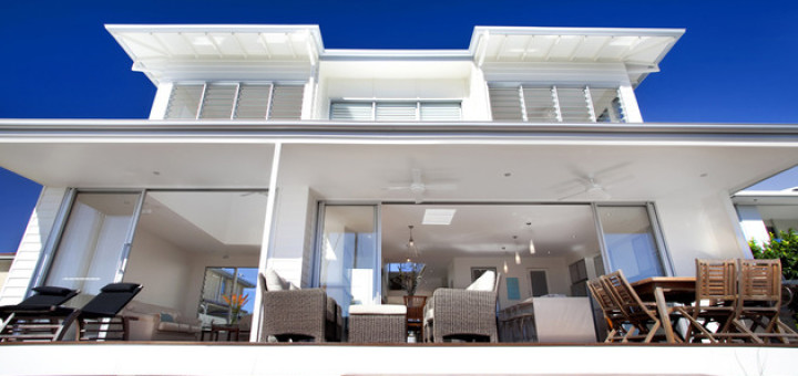
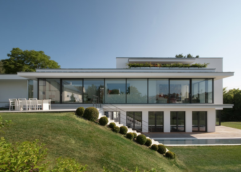
Philipp Architekten has given us an example of White House Design. The white color is believed to symbolize purity and serenity. Not surprisingly, many people who want a house shades of white in order to get peace in it. It feels, ‘ House M ‘ in Germany has really embodied this concept. Moreover, coupled with a view of the hills, the white house really feels like a ” paradise ” for the residents. An architectural firm from Germany, Philipp Architekten, managed to build a house with a stunning design in a narrow area. This white house was built for a married couple with two small children.
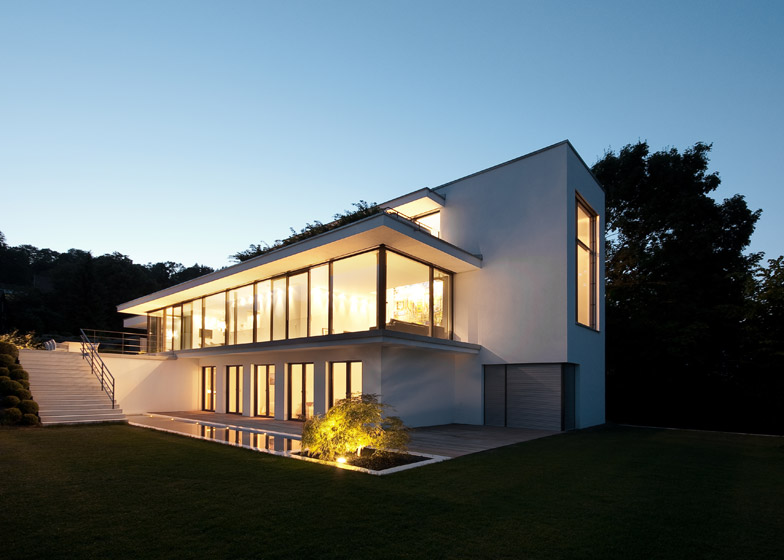
This white house design was built following the slope locations exist around the hills with a series of levels to achieve. The white house is located at the foot of the Swabian Alps in Balingen, Germany. With a relatively small area, the white house was put on the entrance of the first floor, and then immediately ushered owner entering deeper into the three floors. For this reason, house with white domination was built to be able to provide ample room for the family to do activities.
“In short, this white house design was built to create a light-filled living space for the family, the arts, and their books,” said Anna Philipp, the architect. This house, built with vertical blocks so that when viewed will only appear one-sided. Yet more than that, this house has an extensive library and stretches over two floors.
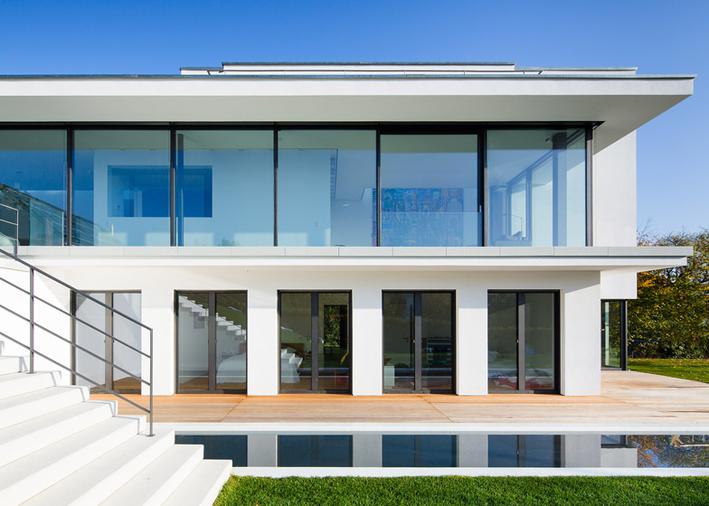
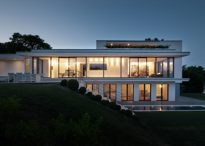
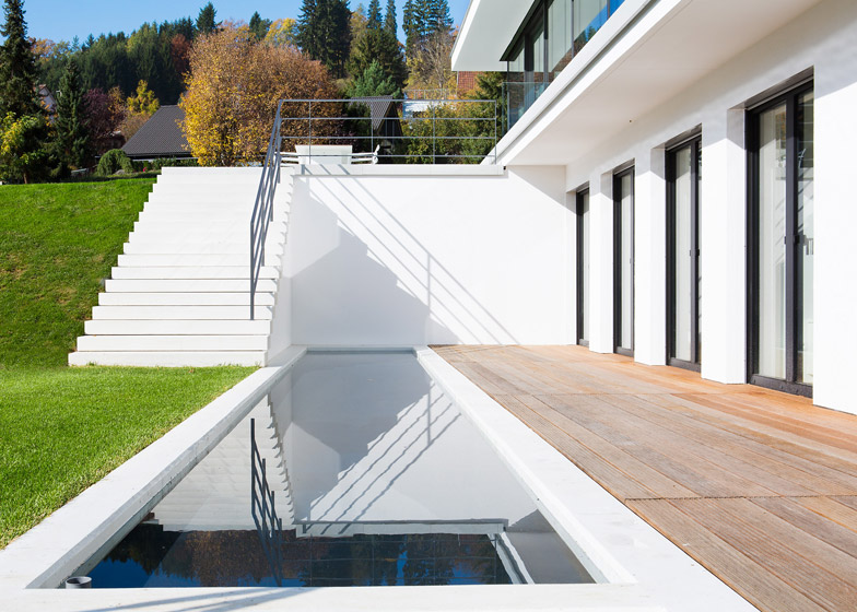
The existence of an interior cube behind the vertical and horizontal glass in front of the house makes this home has its own charm in terms of reduction of building materials. Glass and terraces placed along the facade to the south to maximize sunlight when afternoon. The additional sliding doors provide easy access between the rooms in the home and outside the home.
A pond is also added on the south side to help frame the house to keep the settings, and also to reflect light and shadow in the white house design. A house with a long reach 33 square meters is divided into two zones. Social or public space displayed horizontally along the first floor, while the private spaces arranged vertically between the ground floor and one on the back.
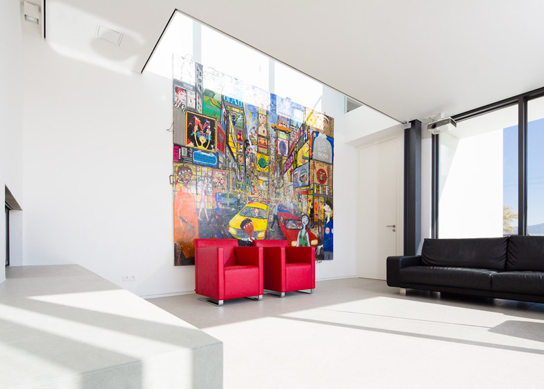
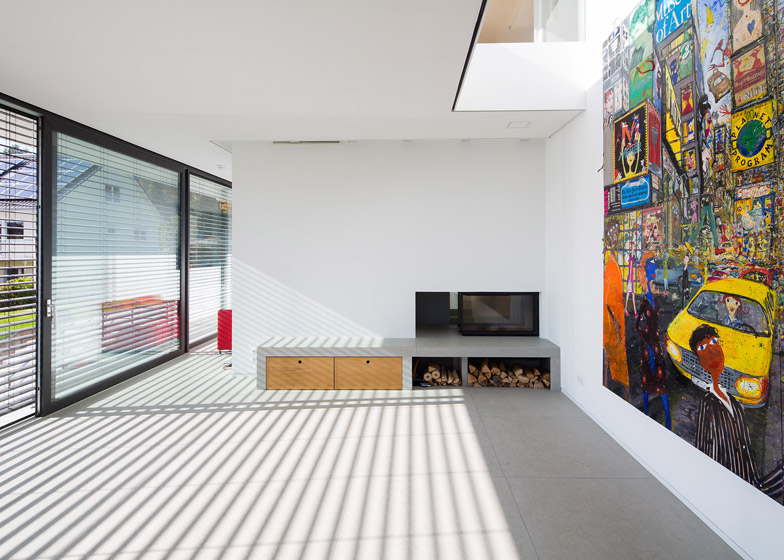
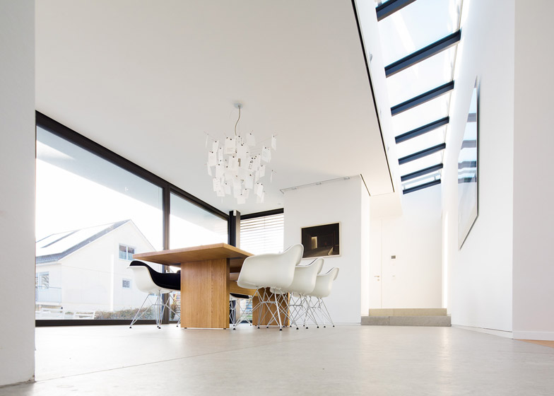
Dining room, kitchen, and living room are on the upper floor following the line of the entrance series.While there are three bedrooms on the ground floor with direct access to the terrace and pool. Anna Philip made a home center to get a lot of light to the interior of the house has the character of such a museum. A blank space has also been made by cutting between the living room and upstairs for the sake of a great artwork on the walls.
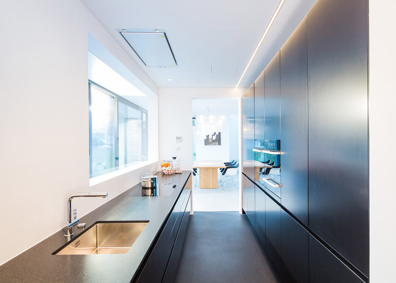
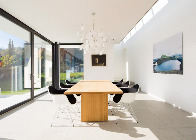
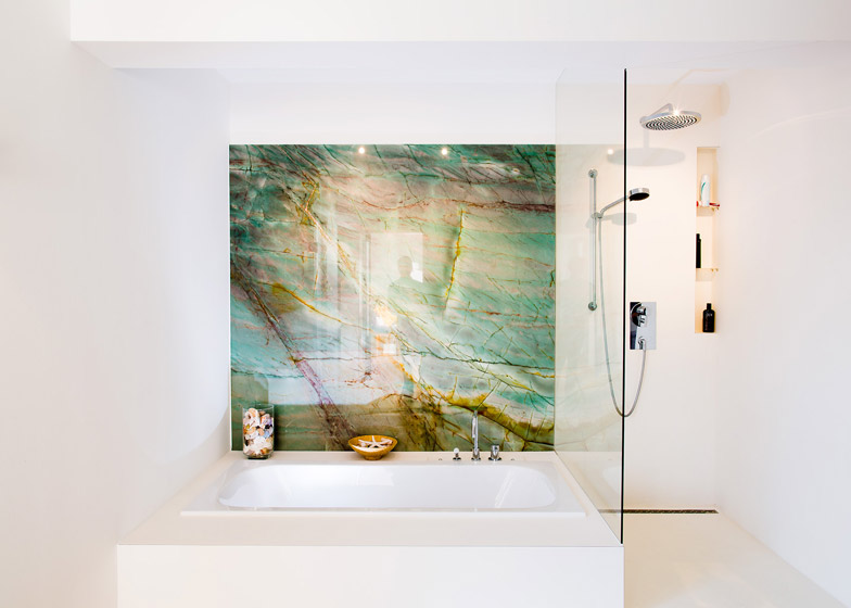
To illuminate the white house when the night, Ingo Maurer lamp steel which has 80 sheets of blank paper and a print hanging in the middle of the dining room. White color dominates this house, except the kitchen which are colored black in order to make an interesting contrast with the other household. In addition, one of the bathrooms in the ‘ House M ‘ has a wall covered with gold eksposi resin.
Image Credit : Udo Geisler/Philipp Architekten
