10 Top Responsive eCommerce WordPress Themes 2015
Best Premium Responsive eCommerce WordPress Themes 2014 which I describe below is the fastest way to build e-commerce sites without requiring knowledge of web programming. However, they were able to deliver amazing performance to run an online store that you have. So you do not need to waste time on this technical part. Now, be owner immediately from one of eCommerce WordPress Themes below and increase your sales exponentially. Good Luck !!
1. GOODSTORE

GOODSTORE : 16 Predefined Homepages and more you can create with drag & drop page builder. Seo Optimized, Retina and Responsive Design, Easy To Costumize Style and Colors, Flexible Layout 980px x 1170px.
2. SHOPTAN
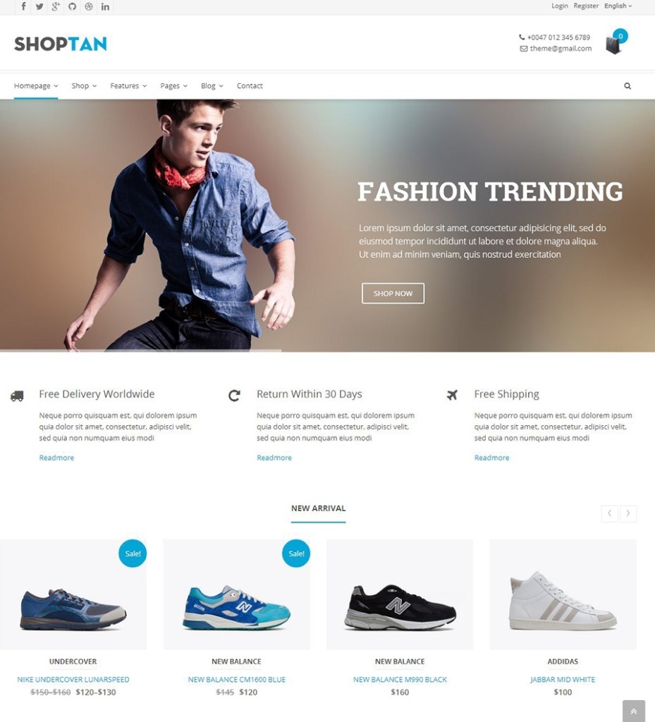
SHOPTAN : Build any layout you can imagine with drag and drop builder plugin – no programming knowledge required. Slider Revolution is currently the top selling plugin on Codecanyon and widely used by theme authors on Themeforest. With WPML you can translate pages, posts, custom types, taxonomy, menus and even the themes’ texts. Products Slider with options : onsale, featured products, best sellers, latest-products and multi-sorting options.
3. ALOMA
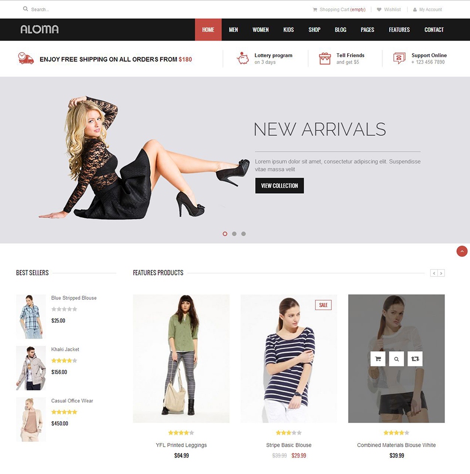
ALOMA : Clean and Modern Responsive WooCommerce Theme, Premium Drag and Drop Page Builder, Unlimited Fonts and Colors, 5 Home Pages Styles and Counting
4. MR. TAILOR

MR. TAYLOR : Start your online store right away with Mr Tailor. Fully Responsive, Translation Ready, 650+ Google Fonts, Advance Theme Options, Easy Setup/Video Tutorial, One-on-One Tutorial.
5. WINESTORE
Winestore, for your wine/liquor/alcohol store. A pleasant feeling flows to visitors’ mind with its very own design. A large multi-layered slideshow truly impresses people coming to your store by stunning visual effects and amazing product attractions.
6. STYLO
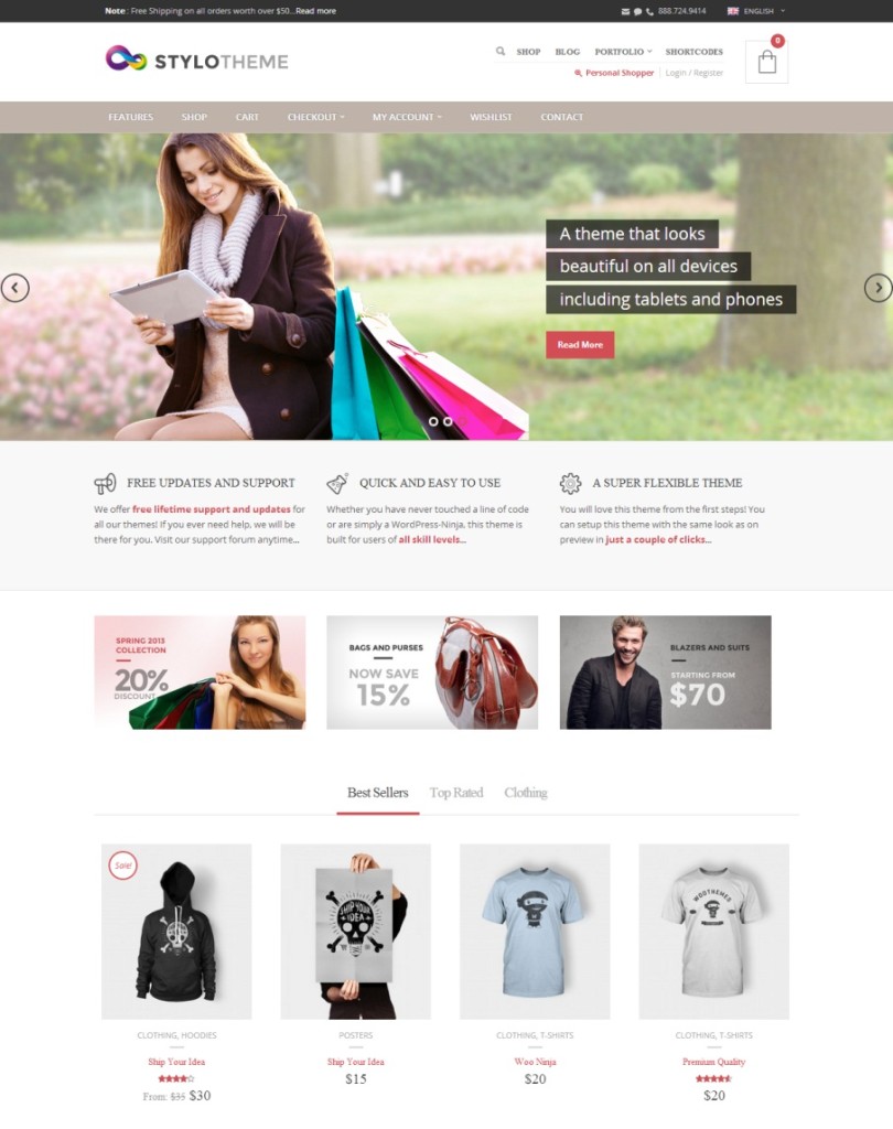
Stylo is a Responsive and Retina ready WooCommerce theme. It features advanced Theme Options panel, Page Builder Support, Localization, Sliders and unlimited Color Schemes.
7. BIG POINT
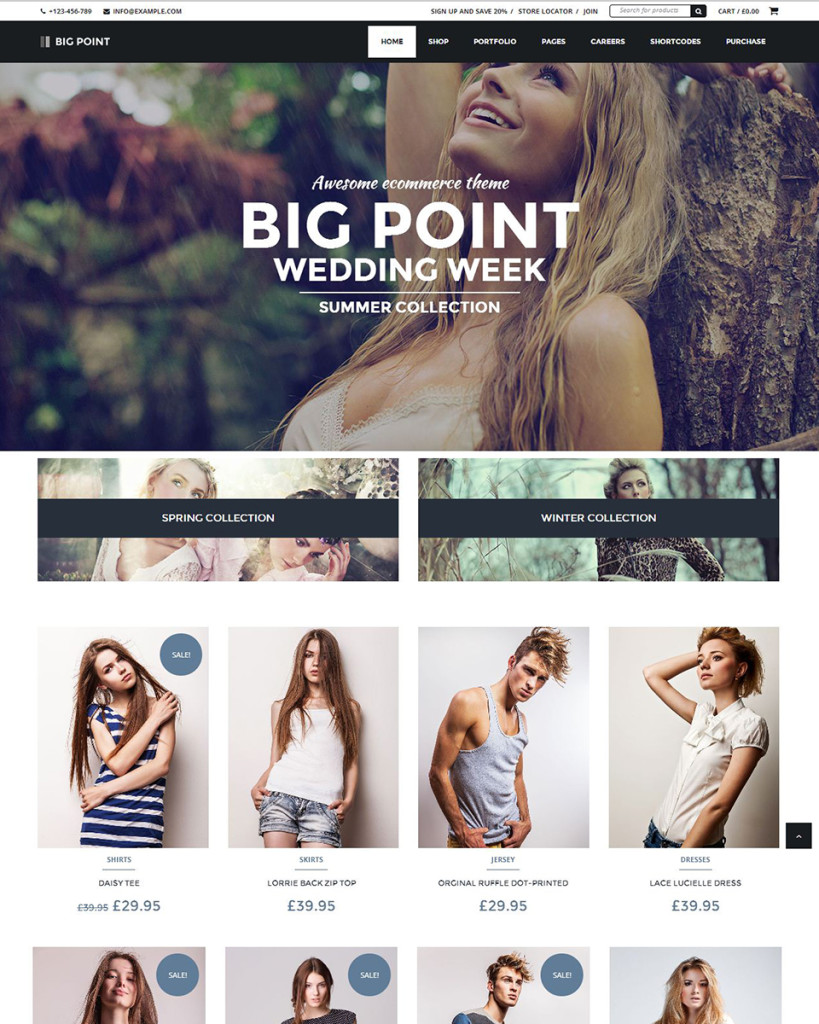
BIG POINT : Awesome Page Builder, with this drag-and-drop feature you can structure the content of your pages without ever having to touch a line of code. Beautiful Responsive Design, Adapt your site for any device. Lotus flower looks beautiful on mobile phones and tablets. Retina Ready on Graphics, high resolution graphics elements are automatically served to devices with retina enabled. Unlimited Colors and Custom BG, Customize totally your site’s look just by simply changing colors and setting custom background.
8. LA BOUTIQUE
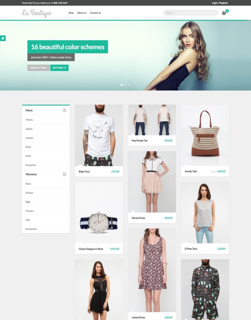
La Boutique : Fully Responsive WooCommerce Themes. Build-in slider, Awesome and fully responsive jQuery slider. 16 beautiful color combinations: Emerald, Turquoise, Green sea, Peter river, Nephritis, Amethyst, Orange, Midnight blue, Belize Hole,Wet asphalt, Wisteria, Pumpkin, Pomegranate, Sunflower, Carrot and Alizarin.
9. CYPRESS
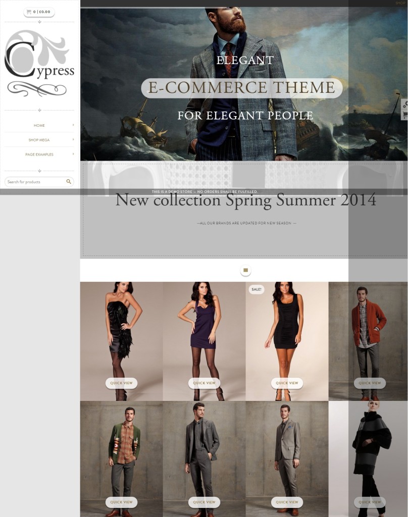
CYPRESS : Create easily MEGA MENUS using standard WP menu editor with addition of custom fields. Add posts, products or portfolios with POST THUMBNAIL or insert CUSTOM IMAGES, split menu groups in rows. Costumize further vertical and/or horizontal layout with SIDE MENU AND HEADER MENU BUILDER. Create infinite layouts in combination THEME OPTIONS and PAGE BUILDERS.
10. GO MARKET
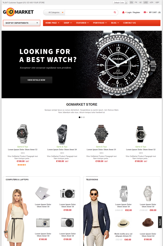
GO MARKET : Combination of Vertical Menu and Main Mega Menu helps customers to have better tool for their shopping. Getting more excited with what they will see in the menu – links / images / video. One thing you shouldn’t miss out is Web Responsive Design that automatically changes its width according to screen resolution. No need extra versions for customers who surf on smartphone or tablet. All in one template is enough.